A personal project to design a brand and packaging for a new fizzy drinks company that makes various mixers and other soft drinks.
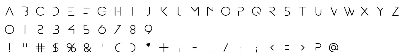
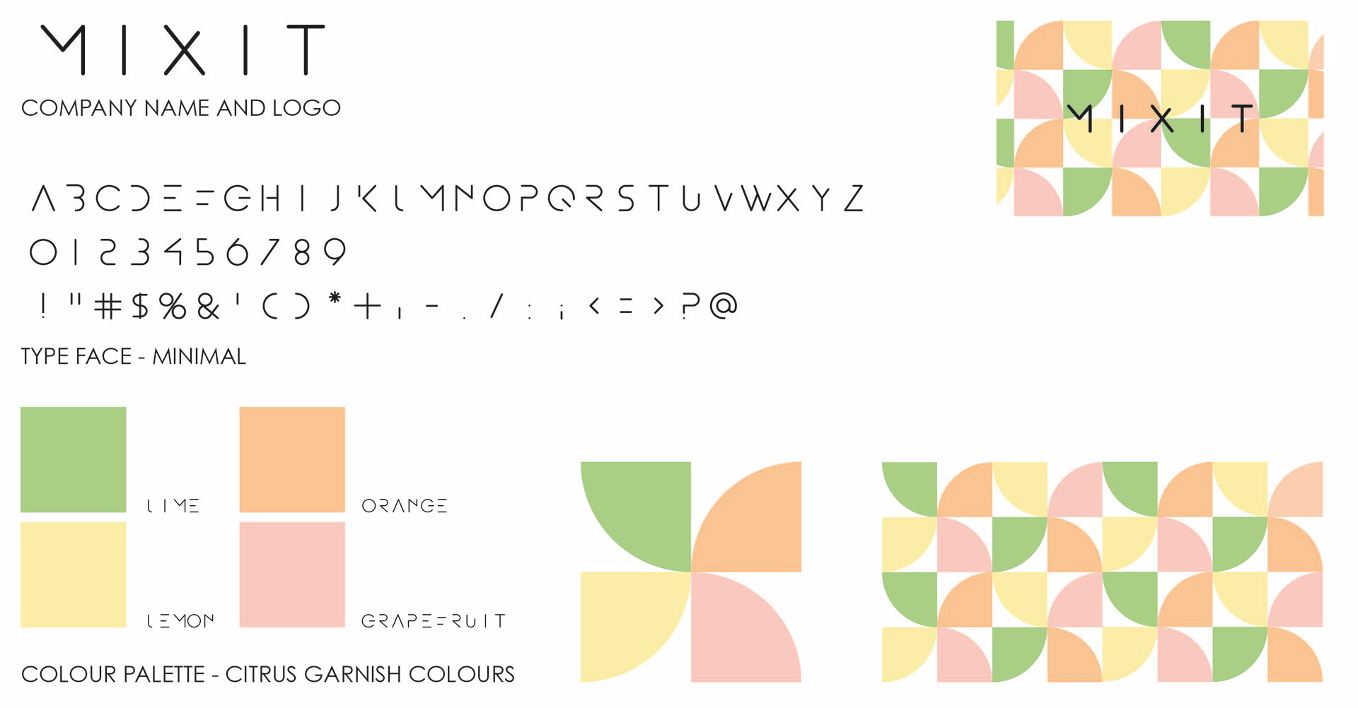
The first step of this was to design the logo and company branding. To do this the first thing I did was create a typeface to use in the logo. This, although very rewarding, was a lot harder than I thought it would be. After a few long days, I had the base of the typeface ready to use.

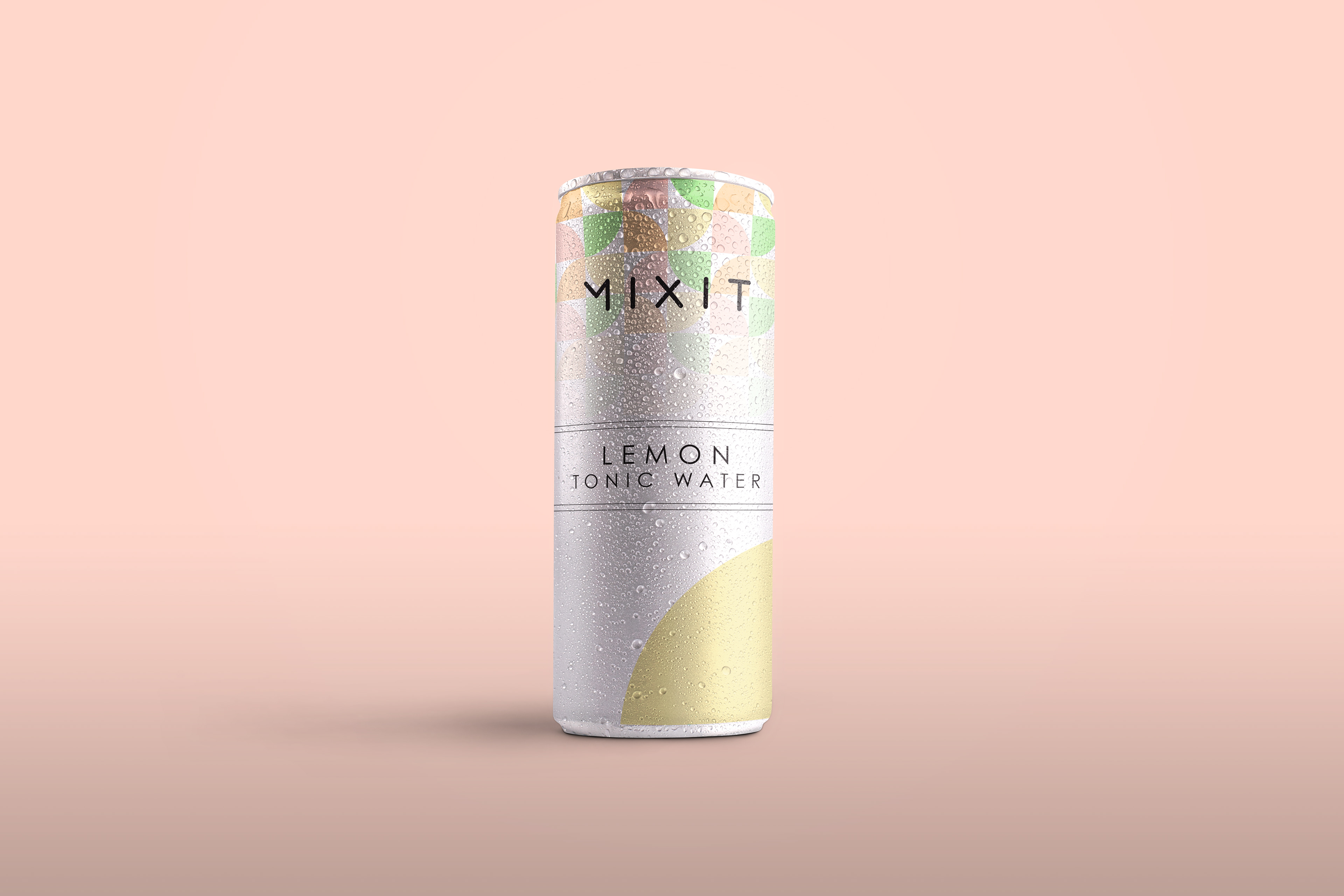
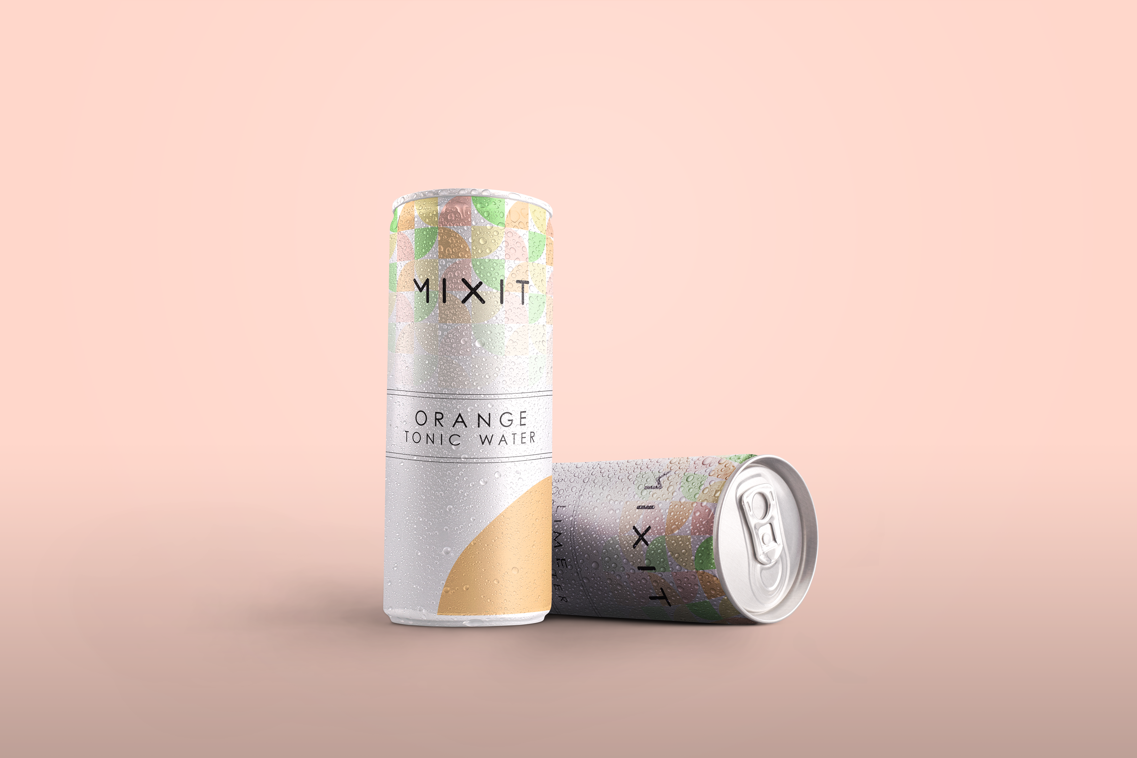
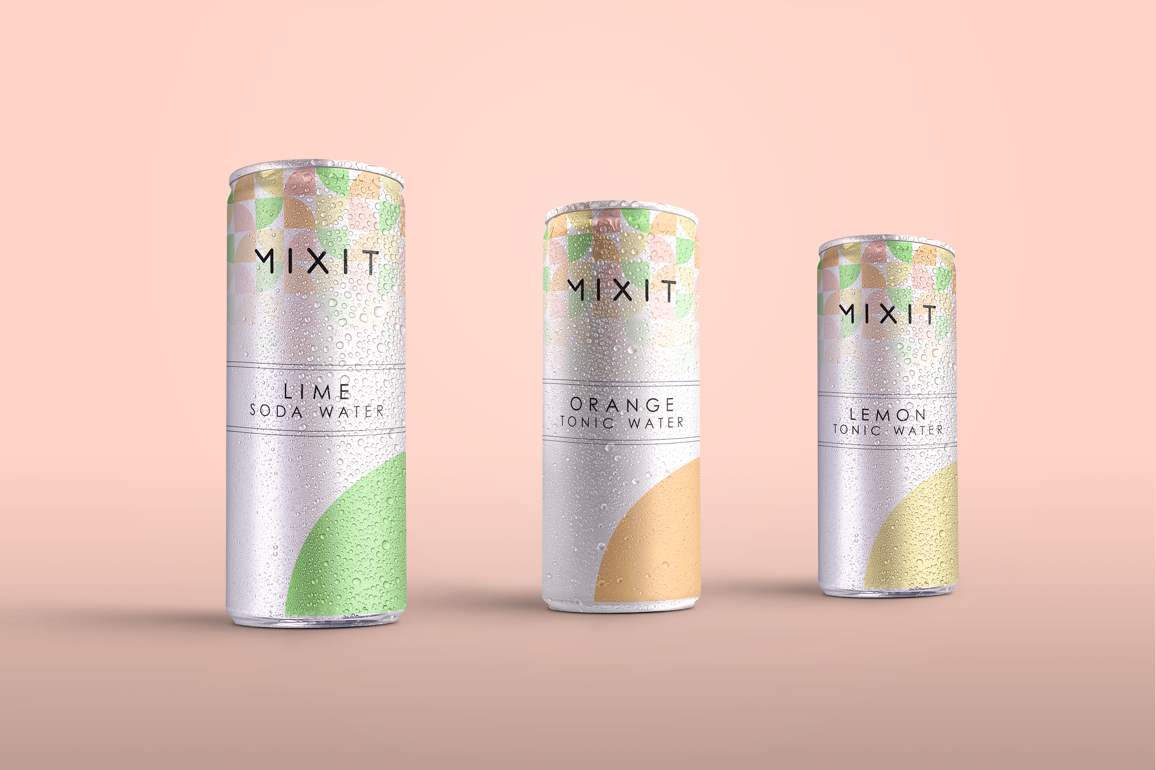
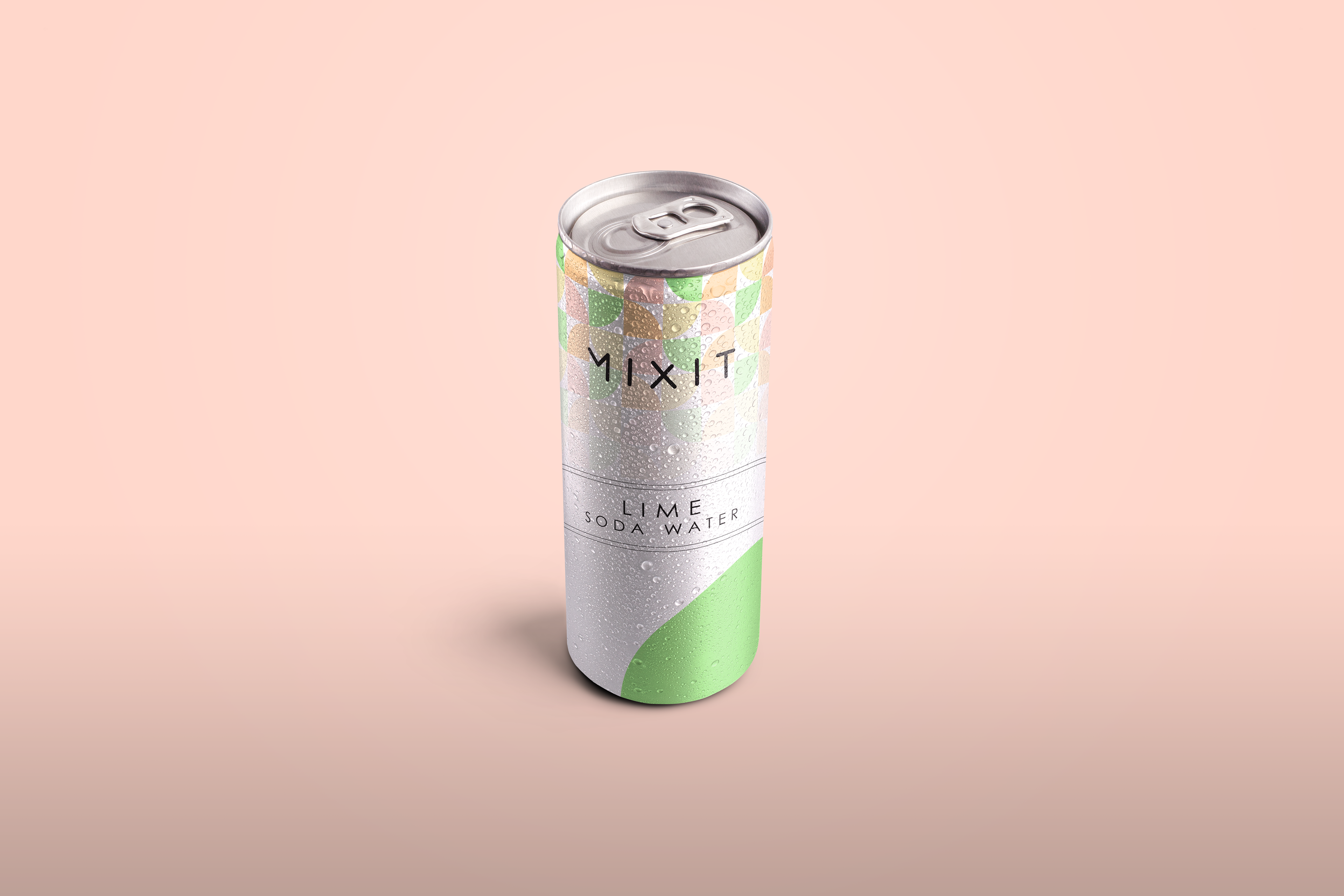
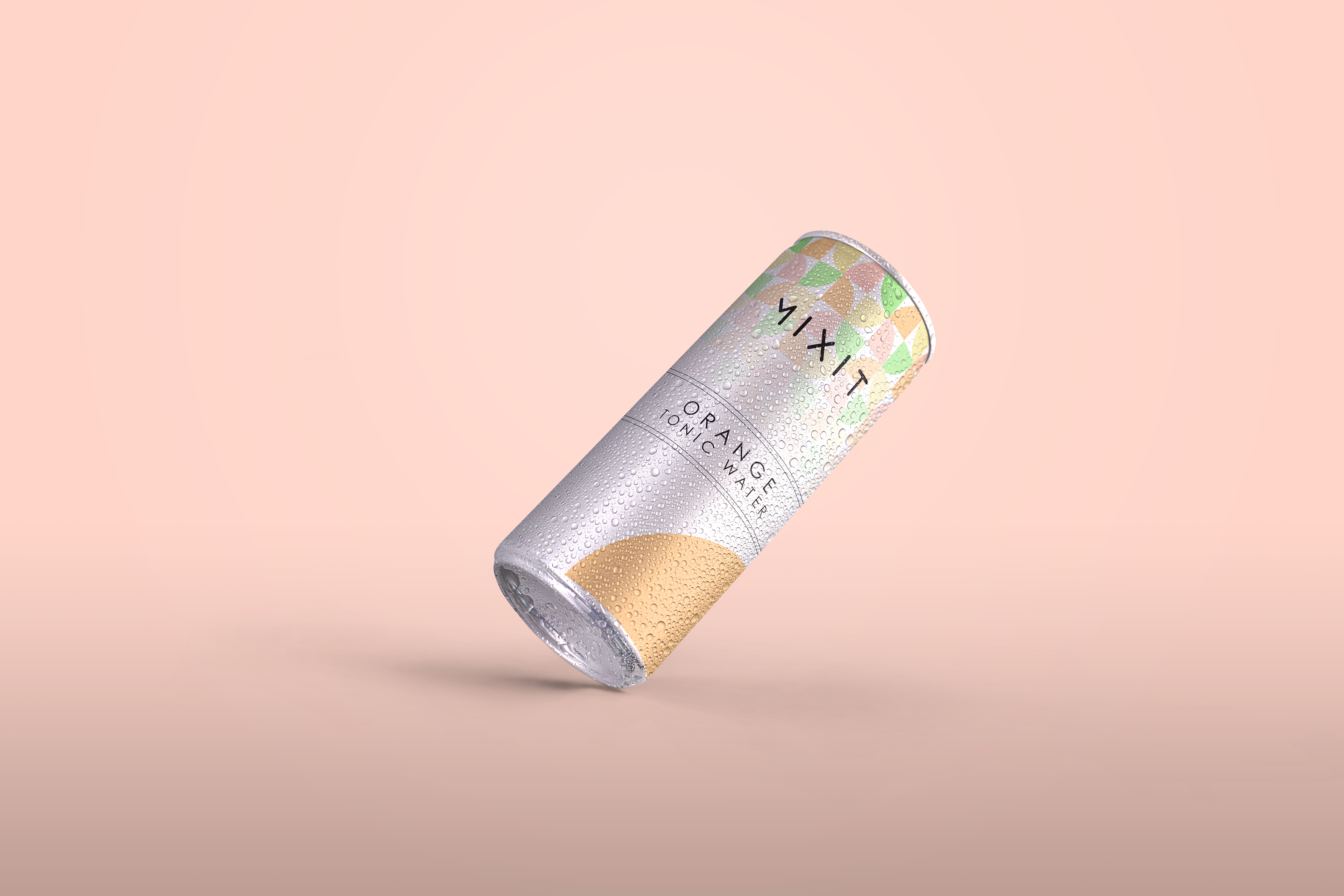
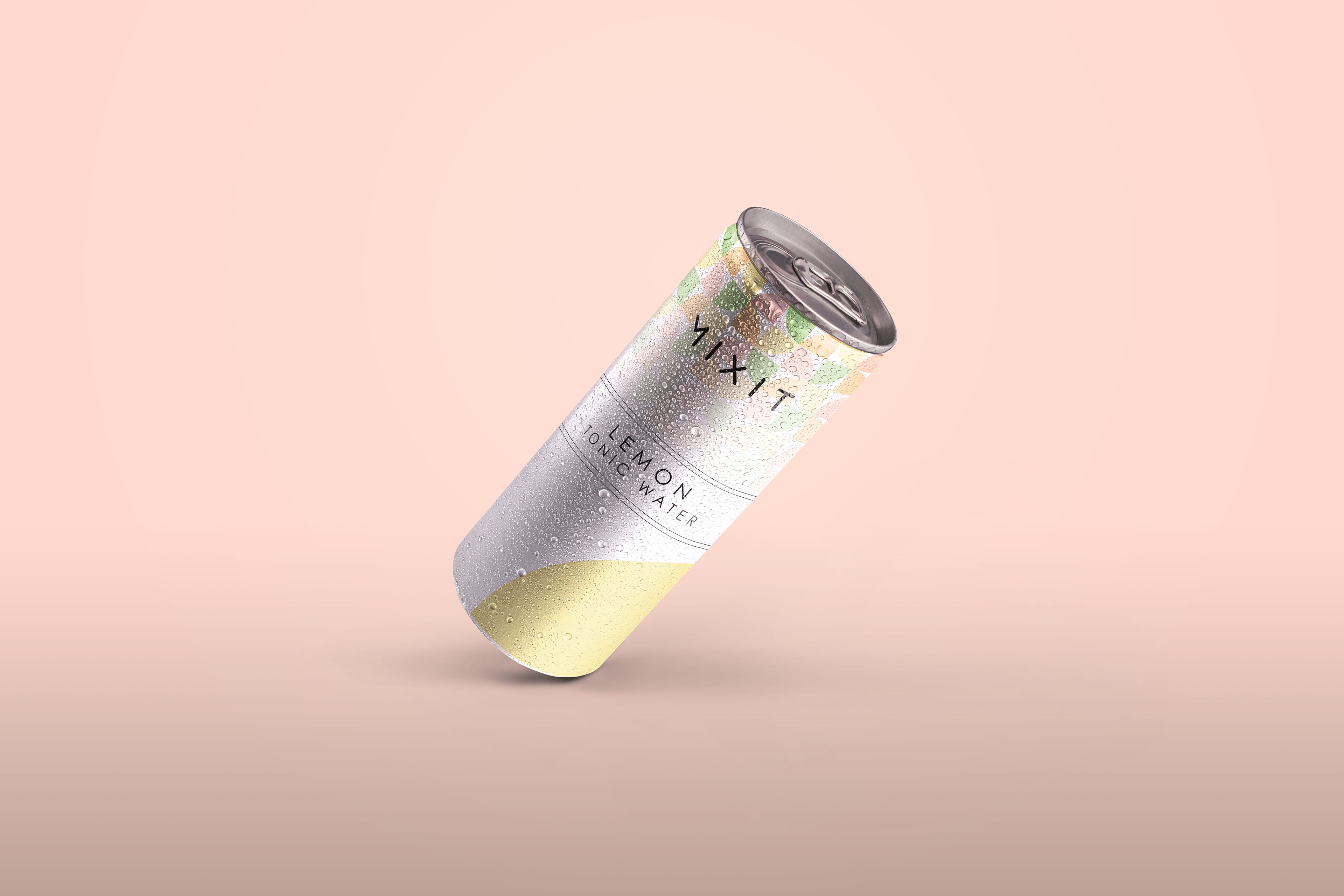
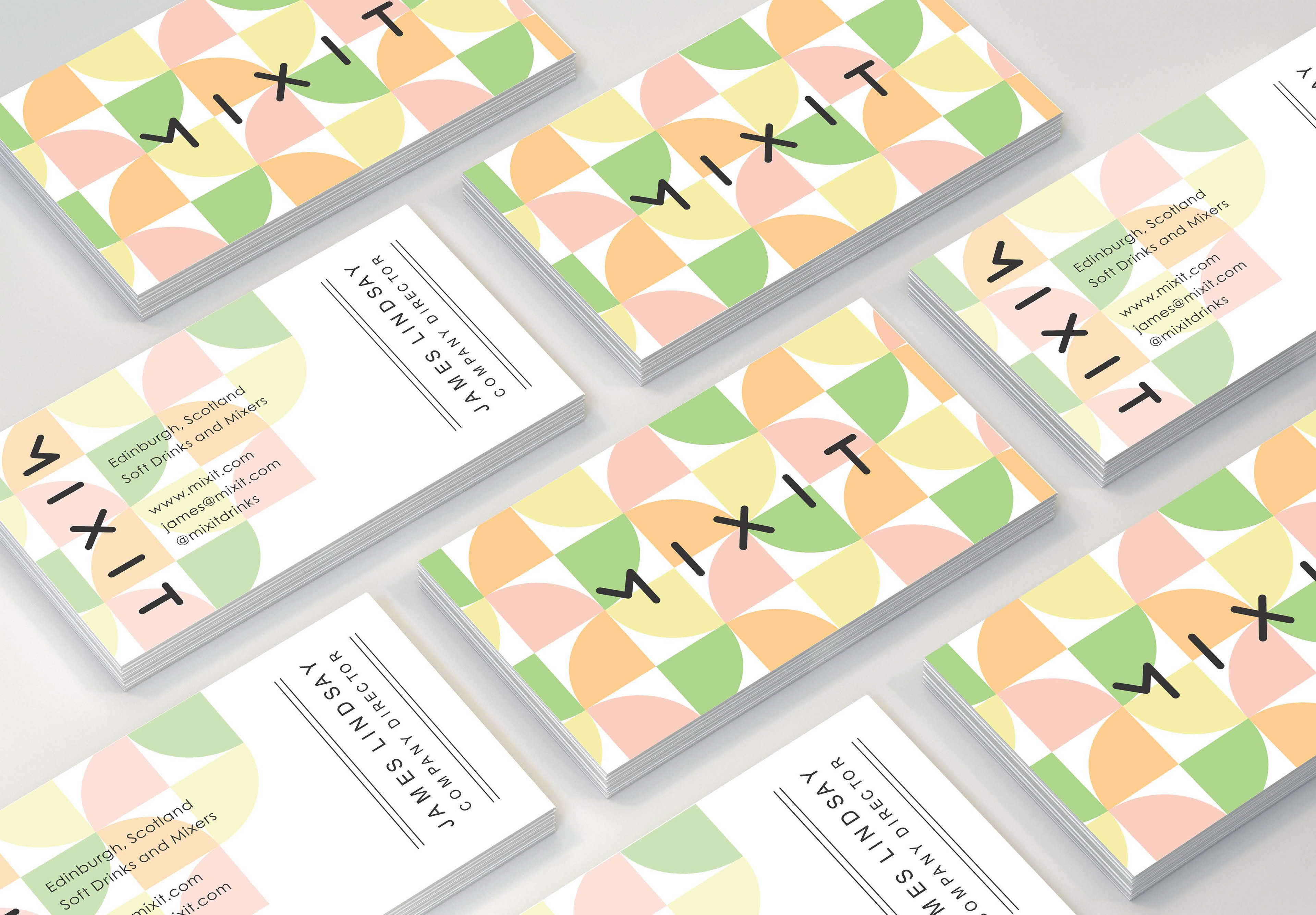
The next step was to start branding. I went for the name Mixit to represent using the drink as mixers for alcoholic beverages. My colour scheme was inspired by citrus fruits that would be featured in the flavours of these drinks - lime, lemon, orange, and grapefruit. The design of the background represents slices of these citrus fruits that you would use as a garnish on drinks, which I put into a repeat pattern to use in both the branding and packaging.
For the packaging design, I took different elements from branding and used them to create the design. I started with the pattern background and edited the opacity to create a gradient fading into the white background of the can. I used one of the 'slices' in the bottom corner of the can which changes colour depending on the flavour of the drink. I then took one of elements from the business card designs to create the label of the can making it stand out against the other design elements/